16~ Mural 2012: Shutters, Banner, and Tower
 |
| Artist, D.K. Pritchett, in Front of Mural |
Wednesday, October 10th, was a half day. My big project for the day was the banner. I'd been putting off lettering it. I'm not a trained sign painter. The thing was over my head (physically, I mean). I'd have to stand on a ladder and still reach up. Lettering is difficult anyway, and this was a long verse on a big, curved banner. I was worried about the spacing and trying to keep the letters fairly consistent. I picked a quiet morning when I was working alone ~ I wanted to focus on the job at hand, giving it my complete attention. Actually, it wasn't as hard as I'd thought it would be. I didn't succeed entirely ~ the letters aren't completely consistent in size (but then, neither is the width of the banner). I'm happy enough with it, and nobody has complained.
 |
| Plane and Banner with Verse from Philippians 3:14 |
Since I didn't have long to work, I picked a few small projects and concentrated on those: some error fixes, the columns by the entrance. Some of our local folks had been nagging me to put the tower (a local historical fixture) on Grassy Mountain. I was all for leaving it out in the spirit of artistic license, but decided to favor them with this minor request. It was a minor thing and would please them. Besides, I could just hear my Dad saying, "You forgot the tower." (The tower is just a tiny blip on the main peak ~ you'd think it was just a clump of trees if you didn't know.) If the tower had messed up the look of the mountain, I would've removed it; but it's barely noticeable, and I've made an old guy in overalls very happy.
 | |
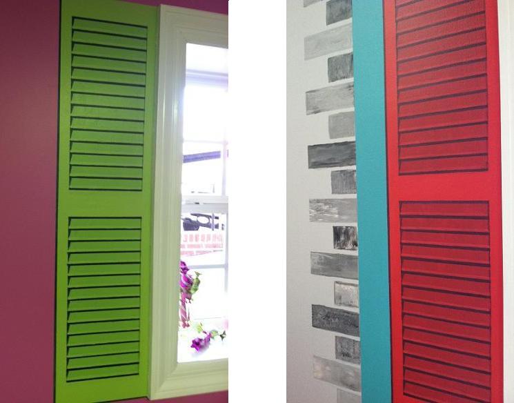
| Two Faux Shutters and Faux-Brick Trim |
 |
| Faux Column Beside Main Entrance |
The previous Friday, I'd had to step away from some of the bigger projects to help with some faux shutters. Some of these interruptions were frustrating, but things had to be done in their own order. If I didn't sketch the shutters, Brenda couldn't prep them, and we did want to get them done. We were into October now, and starting to pay attention to the calendar (especially in light of those bays, which were still barely begun, mind you). Brenda base-coated the area I'd mapped out. Then I mixed the colors for the broad shadows and show her how to lay them in. Afterwards, I did the detailing: striped shadows and highlights to give them a three-dimensional appearance.
All the windows and doors in the room were incorporated into the mural design. For the main entrance, Brenda painted the metal doors a deep, rich blue. I added columns on either side and painted on a roof.
Mural 2012: Wednesday, October 10, 2012 (Plane and Banner)


Comments
Post a Comment
Your thoughts and comments are greatly appreciated!