K&Company Smash Books
 |
| K&Company Smash Book Idea |
K&Company makes a series of scrapbooks called "Smash Book," for scrapbooking on the fly. They come complete with a pen-and-glue-stick combo, and have graphics on most or all pages. Some of the graphics are as simple as ruled lines or photos of an old accounting sheet. Others are more elaborate, nostalgic, or sentimental: cabbage roses, vintage cards or graphics, antique globes...
The Smash Books come in different colors and themes. I won't review them all here, but I've decided to use one of the books that doesn't seem as popular ~ or rather, has generated controversial or lackluster reviews, with some reviewers loving it, some hating it. The one I'm talking about has the light-blue spine. The graphics in this one are an odd mix of vintage, mod, retro, and funky. Reviewers on Amazon have had trouble describing the style. Other Smash Books are more clearly retro or nostalgic or travel-oriented, but this one's a little different. My sample pages may help someone decide if they like the book or not. The graphics are odd. There's a two-page spread in orange, with an old-fashioned electric fan on one side and a large graphic, "You're Cool," on the other.
Another two-page spread has "So Fresh" in small print on one side, and an old-timey carney on the other (a carnival man with a handlebar moustache wearing a top hat, with a big, heavy duty chain hanging around his neck).There are some pages that are sports themed with games or racquets and balls. Anyone can use this book, but I think it would be especially useful to someone doing sports-themed scraps, or a scrapbook featuring "guy" things. I am a little eccentric, so I found that I could use it for odd scraps and vintage pictures.
This method of scrapbooking suits me well. I let the graphics on the pages inspire me with what to stick in there, and I don't have to get too fussy about layout, or planning all the perfect pictures or scraps for a page. I don't even do them in order ~ just stick a scrap wherever it seems to work best. Since the pages all have fun graphics, it's enjoyable to look through the scrapbook whether or not it's finished.
The page at right has a horse. I added "Wilbur-r-r" (a throwback to the old TV series with the talking horse). The right-hand page (not shown) just has brown kraft paper with dotted lines, to write your own story or comments.
Here's a page that just has a retro motel sign. The facing page (not shown) is plain white. I used mine to write a travel story. Some of the pages have ruled lines. I left some of those plain and stamped my own graphics on others.
The two-page spread at the very top of this post has a blank green page on the left, and a full-page graphic on the right, that says, "Why don't you pull up a chair?" I made that into a 1970s motif, adding stickers, an old photo of a girl with bell-bottomed blue jeans, and a '70s-themed birthday card.
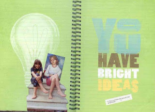
My next photo shows a lime-green, two-page spread with a light-bulb graphic, that says, "You have bright ideas." I used it to feature a funny cut-out picture of two girls. One of the girls is holding a portrait of herself. On the other side, I stuck a fortune from a Chinese fortune cookie. I especially like the Smash Books for these kinds of whimsical scraps: saved trinkets, tickets, fortunes, and funny birthday cards that don't quite fit my other scrapbooks.

Once again, these are sample pages from a K&Company Smash Book (the light blue one). These pages have my own scraps and photos pasted on them. I will add some more examples in my next post.


Comments
Post a Comment
Your thoughts and comments are greatly appreciated!