 |
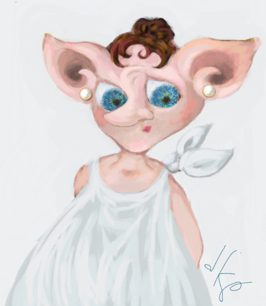
| Rough sketch of Cleopatra and Mark Antony |
As standalone art, this compositions and some of the ones in previous posts would work. This composition proved to be a bit too busy. For the
purposes of the project it would be necessary to remove some of the
background noise so that Cleopatra became the most dominant image. Once again, the layout here is too close to vertical. The forms needed to fit into a square or horizontal composition instead of a vertical
one. Originally, I had envisioned a vertical composition (as the page
was a vertical). Most of the gestures, including this one, show that bias. Changing to a square or horizontal composition was a little difficult, though I had tried to do it here. Sometimes it's a struggle for the artist to adapt the original idea or vision to the particular demands of the media or the project at hand.


Comments
Post a Comment
Your thoughts and comments are greatly appreciated!